A battery guardian that speaks up before it is too late.
Low Battery Alarm lets people set custom alerts for any battery percentage, with an audible alarm of a chosen length. The product design team took it from a single utility screen to an account-based app: onboarding, authentication, alarm setup, payment and feedback.
Role
Product designer on a team
Platform
iOS & Android
Team
Design, 2 engineers, PM
Scope
End-to-end app UI
02 — PROBLEM
Built-in warnings are fixed, silent and easy to miss.
01
Fixed thresholds
System alerts fire at preset levels. Heavy users need warnings earlier, light users later.
02
Easy to miss
A banner or a single beep goes unnoticed in a bag, in a meeting or during a call.
03
No control
People cannot choose how long an alert lasts or keep several alerts for different situations.
03 — DESIGN INSIGHTS
What shaped the design.
01
Percentage matters most
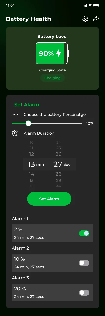
A single slider for the trigger level is the primary action and sits at the top of the setup card.
02
Duration needs a familiar control
A minute and second wheel picker feels like the native timer, so no learning is needed.
03
Alarms are a list, not a setting
Users keep several alarms and switch them on and off, so each gets its own toggle row.
04
Charging state builds trust
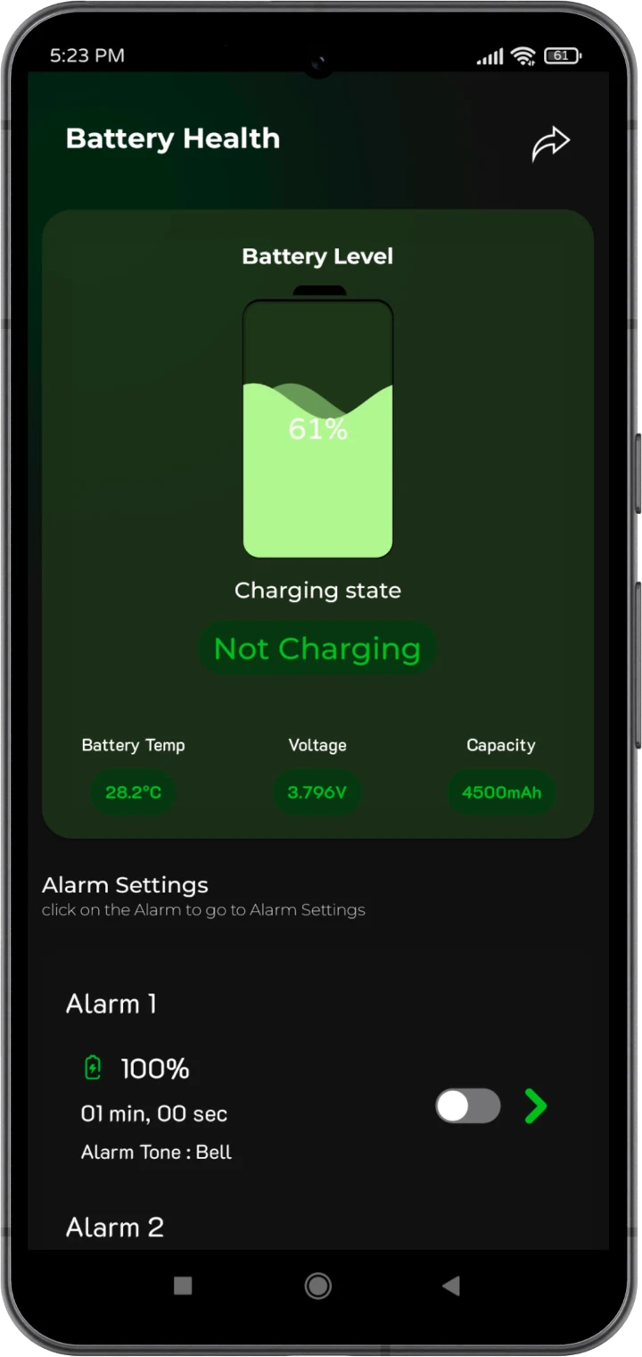
Showing level and charging status together confirms the app reads the real battery.
04 — USER FLOW
Install to first alarm in five steps.
01
Splash
Get Started
02
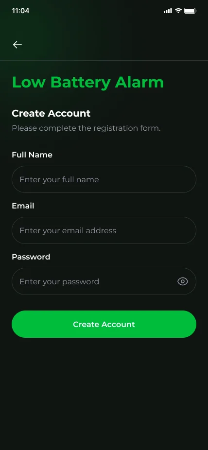
Sign up
Email, password
03
Verify
4-digit code
04
Home
Battery health
05
Set alarm
Level, duration
Branch: Returning users skip to Login. Unverified accounts return to the 4-digit email code.
05 — UI SCREENS
Green on black. Status at a glance.
01
Splash
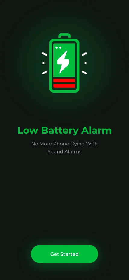
A glowing battery icon and one clear call to action set the tone.
02
Login
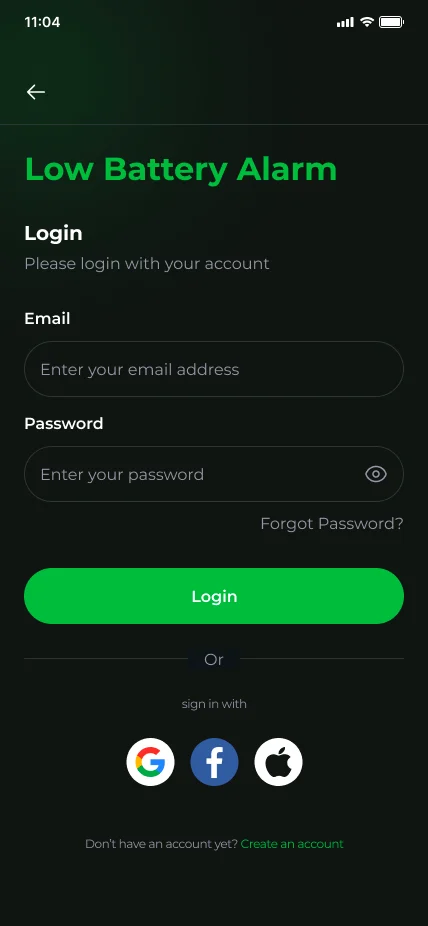
Pill inputs, password reveal and Google, Facebook and Apple sign-in.
03
Verify email
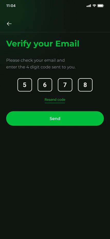
Four large digit boxes with a resend link keep the step quick.
04
Home
Battery level, charging state, slider, wheel picker and an alarm list with toggles.
05
Payment method
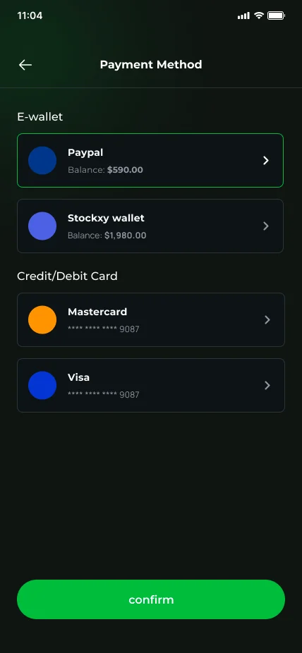
E-wallets and cards are grouped. The selected option is outlined in green.
06
Feedback
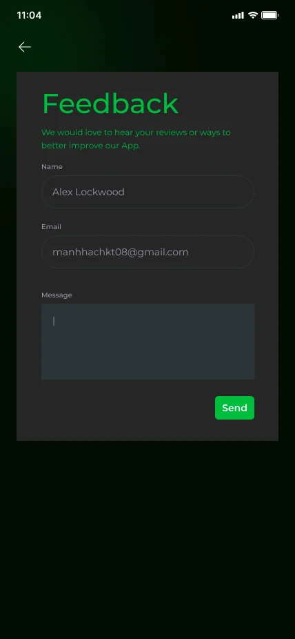
Three fields and a single Send action.
06 — DESIGN SYSTEM
A small kit with one loud color.
Color
Signal green
#00BF3F
Background
#0B110D
Card
#262626
Alert red
#FF0000
Text
#FFFFFF
Muted
#8A948E
Type · Montserrat
Aa
Title 22 Bold
Label 16 SemiBold
Body 14 Regular
Primary buttonInput fieldChargingLow
07 — LEARNINGS
What the project taught us.
01
One accent color does the work
Green means safe and charging, red means low. Limiting the palette made status readable instantly.
02
Reuse native patterns
The wheel picker removed the need for instructions and cut setup errors in testing.
03
Test copy early
Small label fixes, such as the spelling in the percentage prompt, are worth catching before handoff.
Want an app like this for your business?
Tell us about your idea and we will plan the design and build with you.